Nike and the NBA unveiled their latest City Edition jerseys and this is our ranking
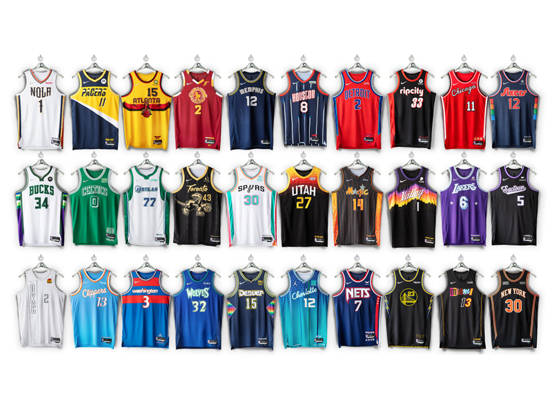
We’re celebrating the NBA’s 75th Anniversary this season and it’s only fitting for each team to celebrate their city’s fandom the best way possible. This season’s uniforms look back at key moments of each franchise, bringing out key details seen across all 30 teams throughout the league’s 75-year existence.
For the most part, the teams got their kits right. But it’s also probable for some teams to miss the mark. While we do have our biases (Go Grizzlies!), we took to account what the teams tried to do and ranked them from our favorite to the least favorite. Here’s a brief description of what the teams wanted to do, and where they rank on our list:
30. Oklahoma City Thunder
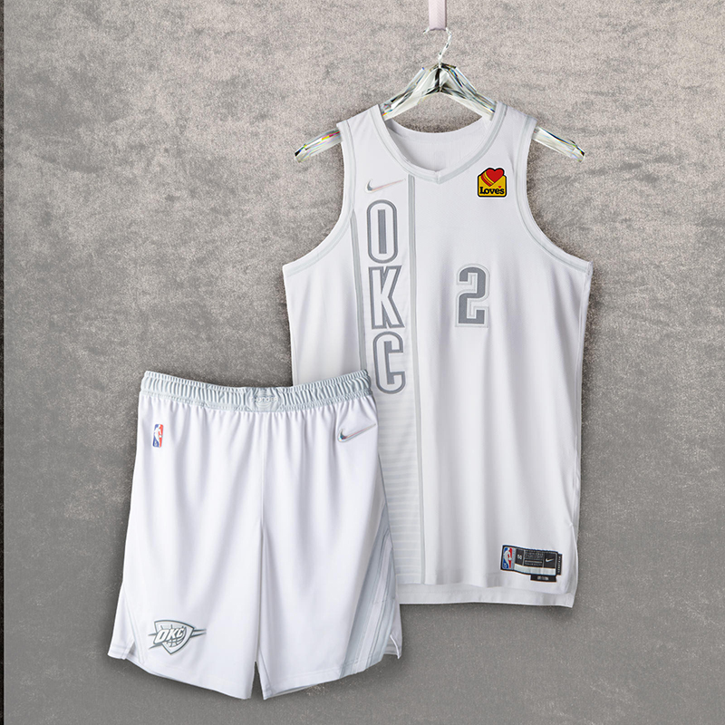
Atop a white base, the uniform brings back the vertical lettering from the Thunder’s first alternate uniform, worn from 2012 to 2016. Also returning is the team’s belt buckle graphic from its first practice uniforms. Additionally, the sash detail on the shorts from the 2018-2019 Nike NBA City Edition uniform honors Oklahoma’s indigenous culture.
We all loved it when the Heat did it back in 2012.
Yes, 2012.
29. Cleveland Cavaliers
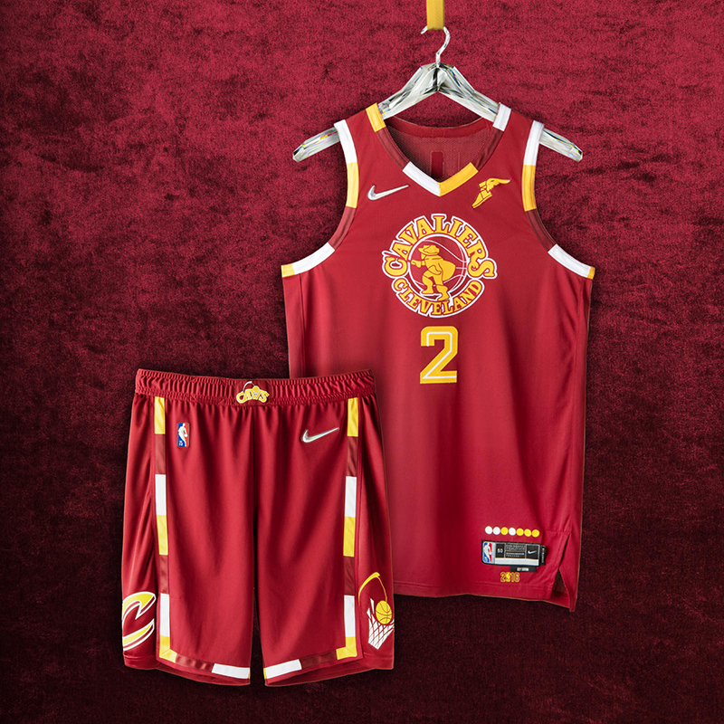
The uniforms are styled in the franchise’s classic crimson and gold, a pattern that honors the return of the team’s swashbuckling swordsman from the ’70s and the Miracle at Richfield. The jersey pays tribute to the ’16 championship season, and the legendary comeback that brought the city its first title in generations. The shorts rep the Cavs logo from the ’80s and ’90s playoff runs on one leg, and the logo from the historic ’16 season on the other.
The musketeer was a nice touch, but the jersey just feels empty…and busy at the same time.
28. Boston Celtics
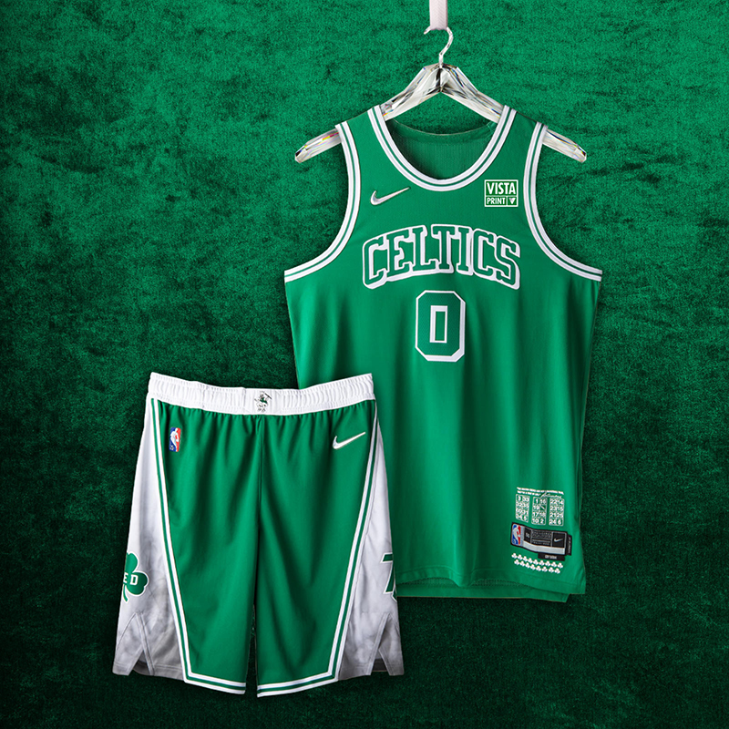
It’s a tall task to pick a collection of greatest moments for your franchise when 17 championship banners hang from the rafters. The Nike NBA City Edition uniforms focus on lettering and striping details from the ’46 and ’49 Celtic teams, as well as some signature details (Lucky the Leprechaun returns) from the franchise’s untouched run in the ’60s.
With so much tradition behind the Cs, I do understand how the best tribute they can do…is come up with a jersey that looks like any other jersey they’ve worn the last few decades.
27. Orlando Magic
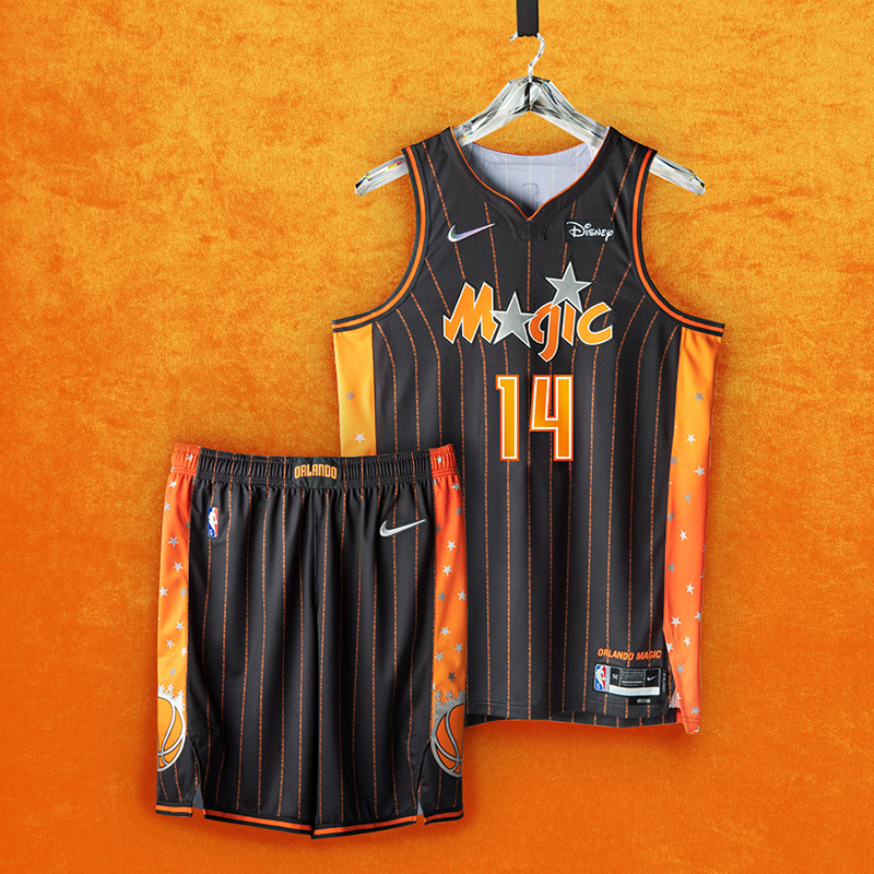
The uniform includes orange and anthracite detailing to recognize the orange groves that helped build the city’s economy, while the neck and arm taping are throwbacks to the team’s original jerseys, with the side insert featuring the first Orlando Magic logo. Two questions that typified the ’90s-era teams — “Why Not Us?” and “Why Not Now?” — are printed up and down the jersey in the form of pinstripes.
“Why This?” is what first came to mind when I saw these jerseys. I loved the Magic when they first made waves with Shaq in the ’90s with their pin-striped jerseys in black and blue. Stop making orange a thing, heck even having Mickey Mouse in front would’ve been better.
26. Atlanta Hawks
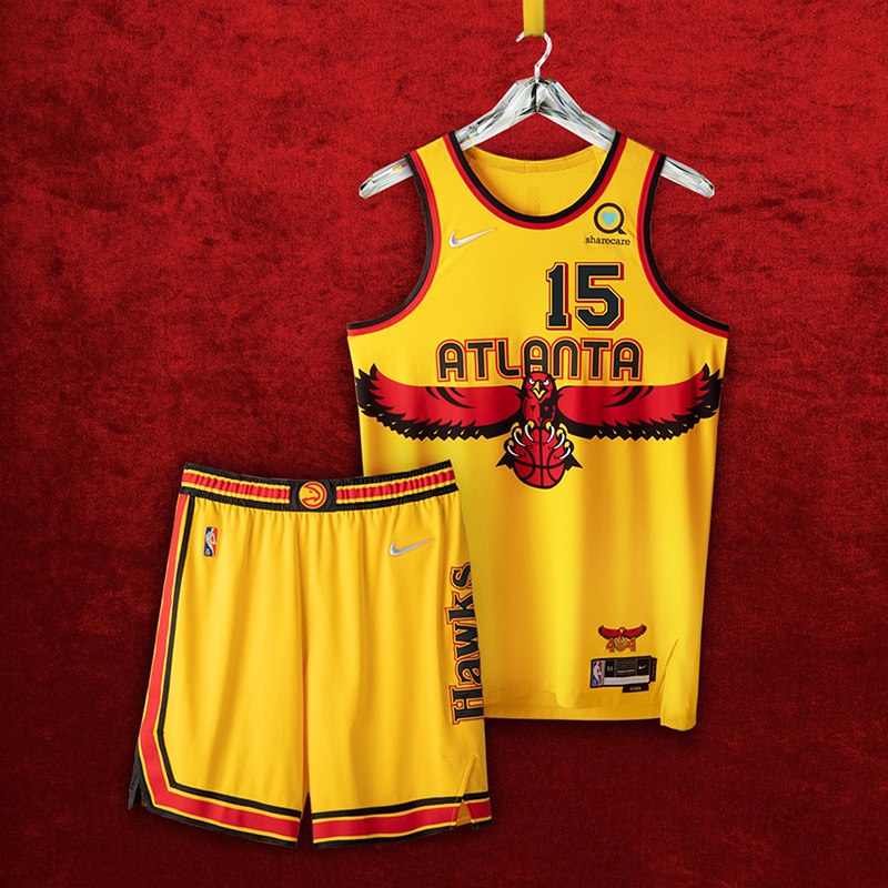
The front numbers and the stripe configuration on the shorts pay tribute to the first uniforms debuted in 1968, while the back numbers hearken to the highlight era of the ’80s. The wingspan logo of the ‘90s makes a bold return across the front, while the beloved Primary Icon logo goes front and center on the belt. And the jersey anthem calls out the city’s iconic “404” with the razor-talon Hawk.
The huge hawk during the Smitty and Dikembe years were god-awful and it just so happened to be right smack at the center of this one. Although I do like the wordmark, everything else just feels too much out there, even for the ATL.
25. San Antonio Spurs
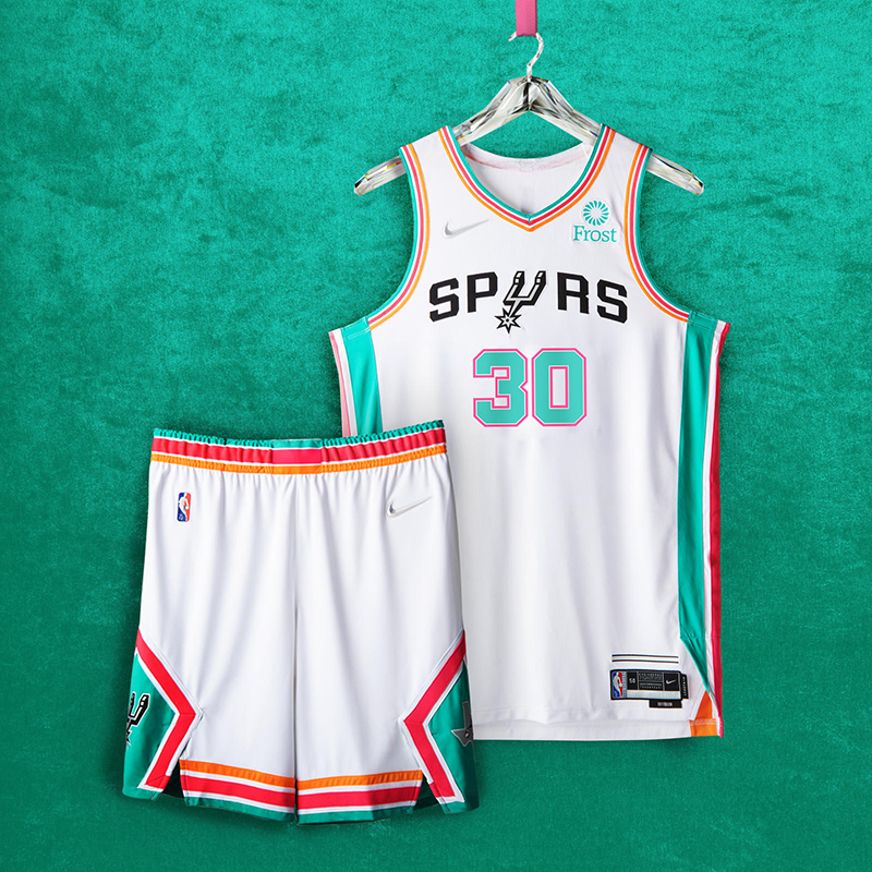
Lining the entire uniform are the franchise’s fiesta stripes, which first appeared on the team’s warm-up jerseys in the mid ’90s. Classic silver and black stripes appear above the jock tag. The shorts feature the boot-spur logo and the angular design of the jerseys worn by the team in the late ’70s and early ’80s, while also bringing back the roadrunner logo of the Dallas Chaparrals, the franchise’s original ABA name.
We love the fiesta colors on the Spurs, but they just feel wrong in white.
24. Dallas Mavericks
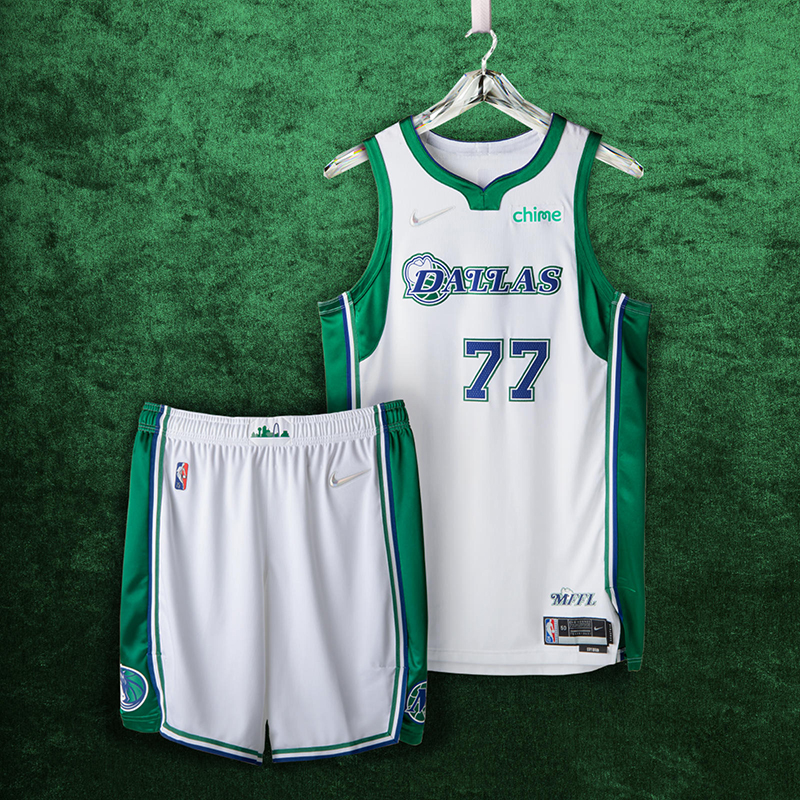
Although the City Edition uniform brings back the green accents and western-style typography of the franchise’s early years, this season is the first time that a cowboy hat is set on top of the Dallas wordmark. The shorts include the style of cowboy hat featured graphically from the team’s first 20 years, the horse from its second 20, and a belt buckle with a giant Texas skyline.
The Mavs have been in the top 15 in jersey design ever since Cubes was on board, but this mashup of their 40-year history just feels like the artist just put all their jerseys into one and called it a day.
23. New Orleans Pelicans
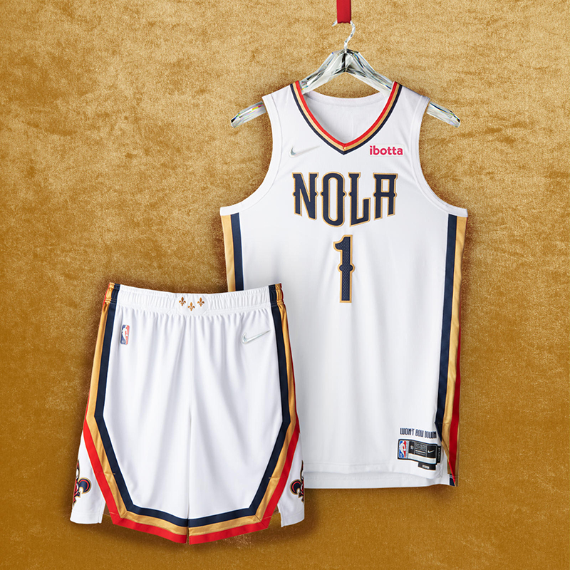
Inspired by the resilience of the city, the uniform combines a white base with typography reminiscent of wrought iron. It also boasts red, gold and navy stripes, as well as the signature “NOLA” emblem, iconic fleurs-de-lis on the belt buckle in Mardi Gras gold, and an anthem that defines the team and its city: “Won’t Bow Down.”
This is definitely an improvement from previous City Edition jerseys they put out…but is their best effort so close to their current Association Edition jerseys? Pass.
22. Houston Rockets
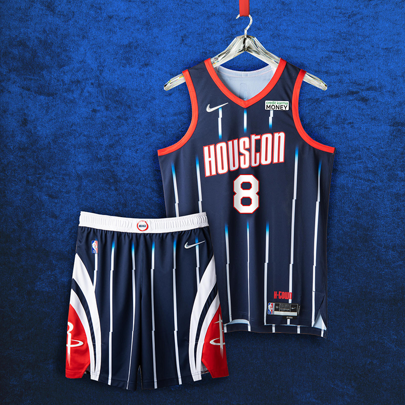
The uniform’s style is inspired by the mid ’90s jerseys, with white pinstripes fading into navy continuing to the shorts. The belt buckle features the team logo from the Clutch City championship years of ’94 and ’95. The two logos, pulled from the 2000s, mark two moments: one for Houston’s No. 1 draft pick, and the other from the team’s memorable 22-game winning streak.
Just like the Mavs jersey, the previous jerseys from the ’90s and 2000s are quite evident with this one. I do think Jalen Green and Christian Wood can rock these with the best, though.
21. Golden State Warriors
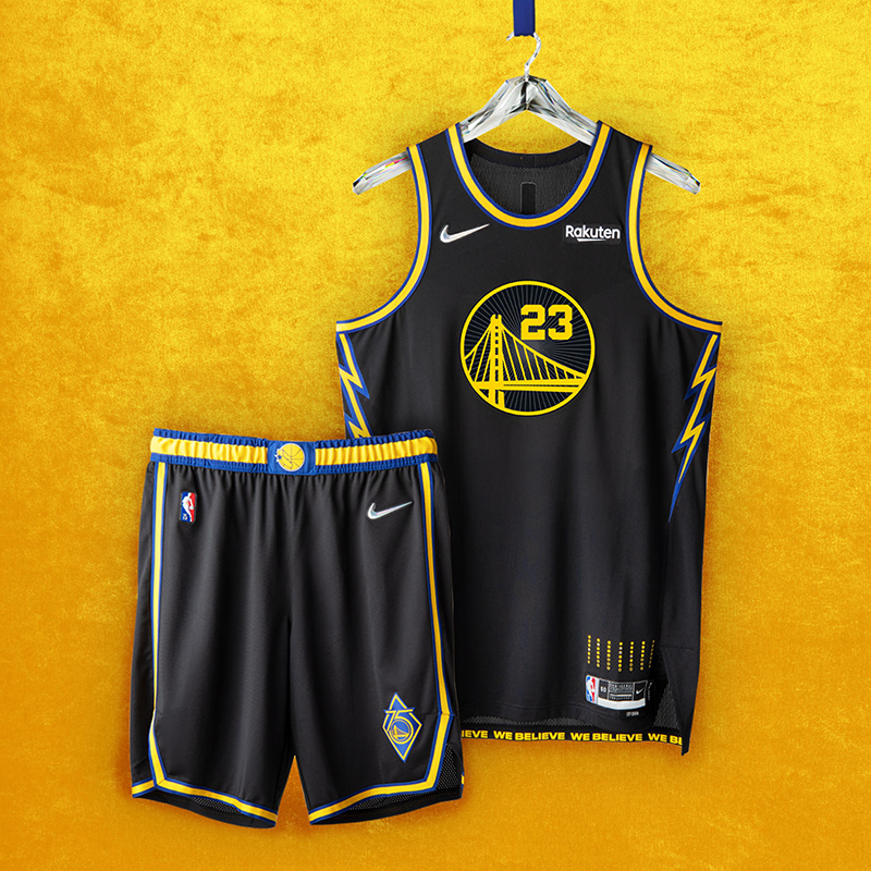
The uniform’s inspiration began with Oakland, the team’s home for nearly 50 years. Based in black, the Bay Bridge logo is surrounded by a design representing the roof of the team’s former arena. As a tribute to the We Believe Warriors of the late 2000s, lightning bolts line the uniform’s side panels. The shorts are embellished with a golden trim and feature two logos: one from the We Believe era, and the other marking the Warrior’s 75th anniversary.
Haven’t we seen this one before? The lightning bolts could’ve been more pronounced and why didn’t they pay homage to the Run TMC era of the Dubs? Everyone’s got a favorite Warriors team, mine just ain’t represented here.
20. New York Knicks
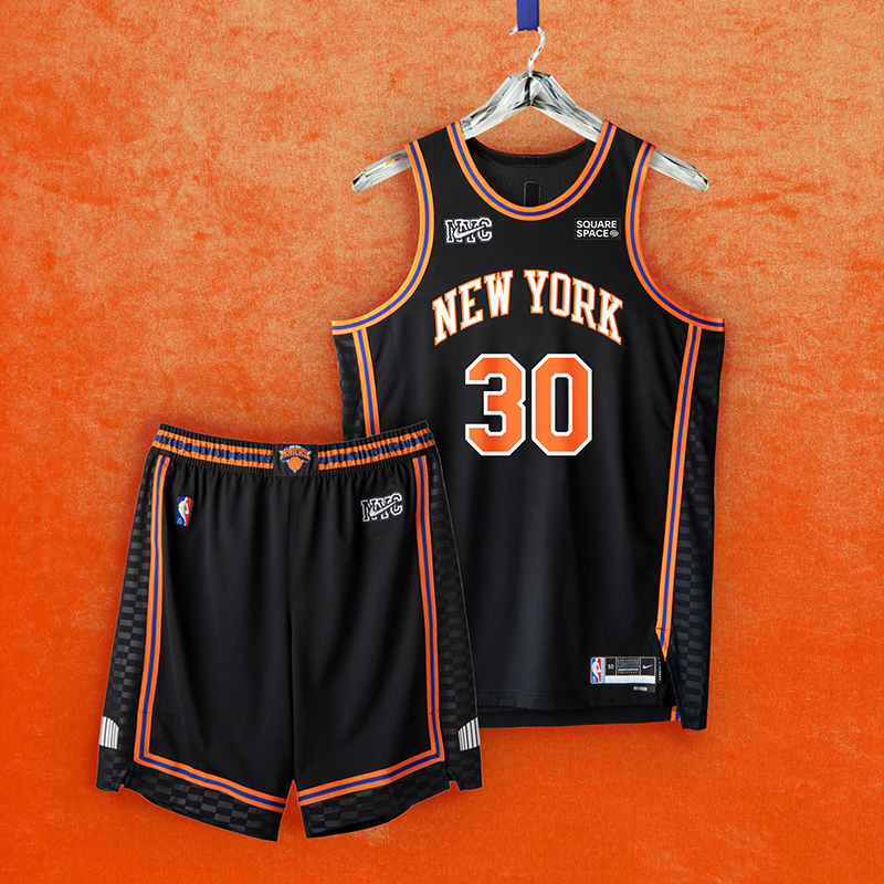
The black uniform features orange and blue piping and checkered side panels. A graphic treatment of the team’s world-famous arena is shown on each leg, while the belt buckle boasts the logo that defined the team in the 2000s. The shorts carry retired Knicks numbers along the waistband.
I don’t know, these should be ranked higher, right? The Knicks, black jerseys, clean piping and trims. But it just doesn’t feel like the Knicks.
19. Miami Heat
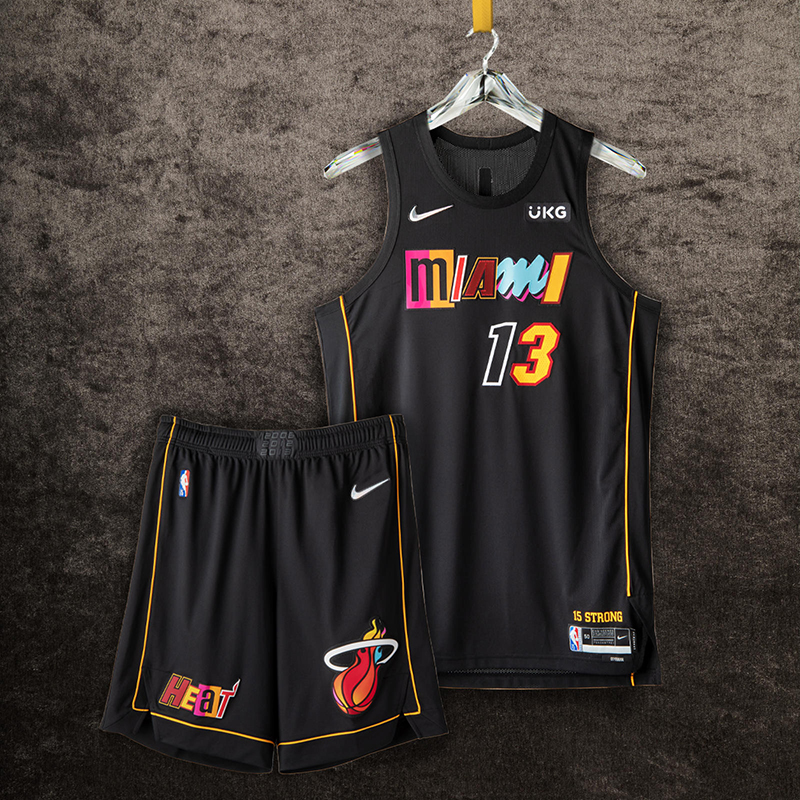
This is a mash-up in the truest sense of the word, comprised of a collage of letters and numbers from the franchise’s most iconic jerseys. The black base is a neutral foundation for the letters pulled from uniform sets like the technicolor Vice Nights jersey, the Miami Floridians jersey and others. Just above the jock tag appears “15 Strong,” referring to the team’s 2006 championship run. Rounding out the uniform is a thin golden stripe that symbolizes the security ropes brought out by arena staff seconds before the thrilling Game 6 shot in 2014.
Were they going for a ransom letter with this one? We’ve seen Miami do great things with their alternate jerseys but this execution could’ve been better. I do like the flaming ball rendition, though.
18. Detroit Pistons
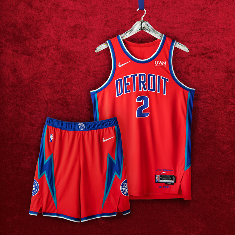
The jersey proudly displays “Detroit” across the chest set against accented teal, royal and white arm taping. The side paneling is a nod to the Pistons squads of the mid to late ’90s. Both the Pistons’ former and current patches are featured on opposite sides of the shorts and are set against lightning bolt strikes, reminiscent of the team’s late ’70s aesthetics. The color-block waistband is a remix of the classic flaming horse logo and the ’90s era graphics.
We’ve seen the red Pistons jerseys during the Grant Hill days and I’m not mad at this. Similar to the Warriors jersey, I wish they did more with the lightning bolts. Why not pay tribute to the Bad Boys in a bigger way? Moving on…
17. Indiana Pacers
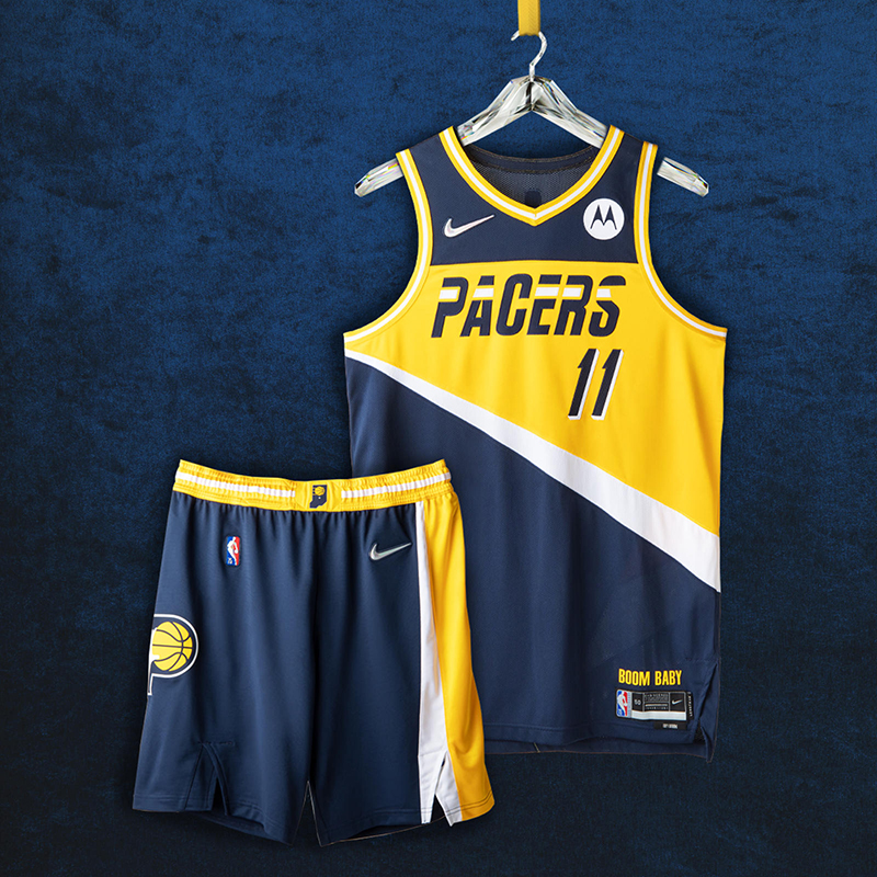
Front and center is the Pacers jersey wordmark from 1987 surrounded by the famous yellow color blocking. More details on the lining and the side paneling pay tribute to the team’s legacy, such as the three ABA championships in the early ’70s and its 2000 Eastern Conference Championship. The shorts include the team’s current logo remixed with the classic look from 1971.
Boom Baby indeed! Like I’ve said, most of the teams got this year’s theme for the City Edition right. The Pacers wordmark and racing stripes definitely hark back to the days when Reggie Miller had his hightop fade.
16. Memphis Grizzlies
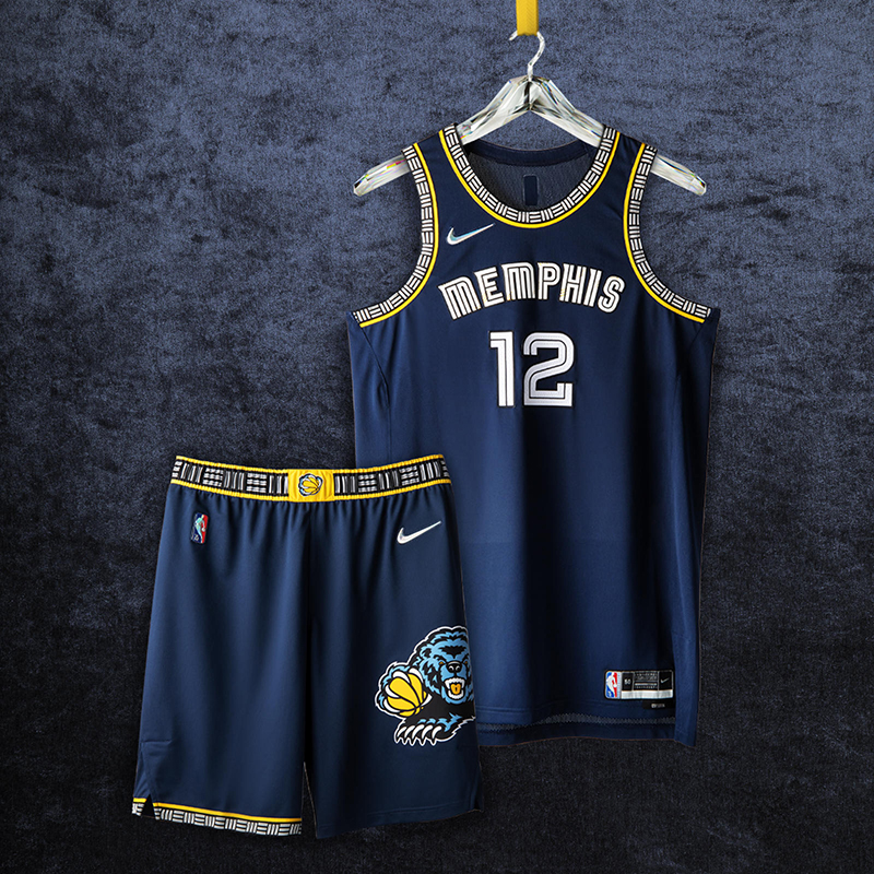
The uniform brings in details from throughout the team’s far-reaching background, from British Columbia to Tennessee. The uniform’s main colors are the midnight blue and yellow that have represented the Grizzlies style since 2004. A stylized “Mem” wordmark from 2018 patterns through the neck, arms and shorts in a design similar to both the original Vancouver uniform and the current Statement Edition uniforms. The waistband has the “claw ball” logo drawing from the original design from Vancouver and those early Memphis years. The shorts have the iconic bear logo from 2002 updated with the current blue colorway.
Go Grizzlies! As much as I would like to rank the Grizz higher, I do have the other teams ranked better than these. The details on these jerseys are great. You can’t see it here but the Memphis wordmark have the bear marks/scratches for that added effect.
15. Chicago Bulls
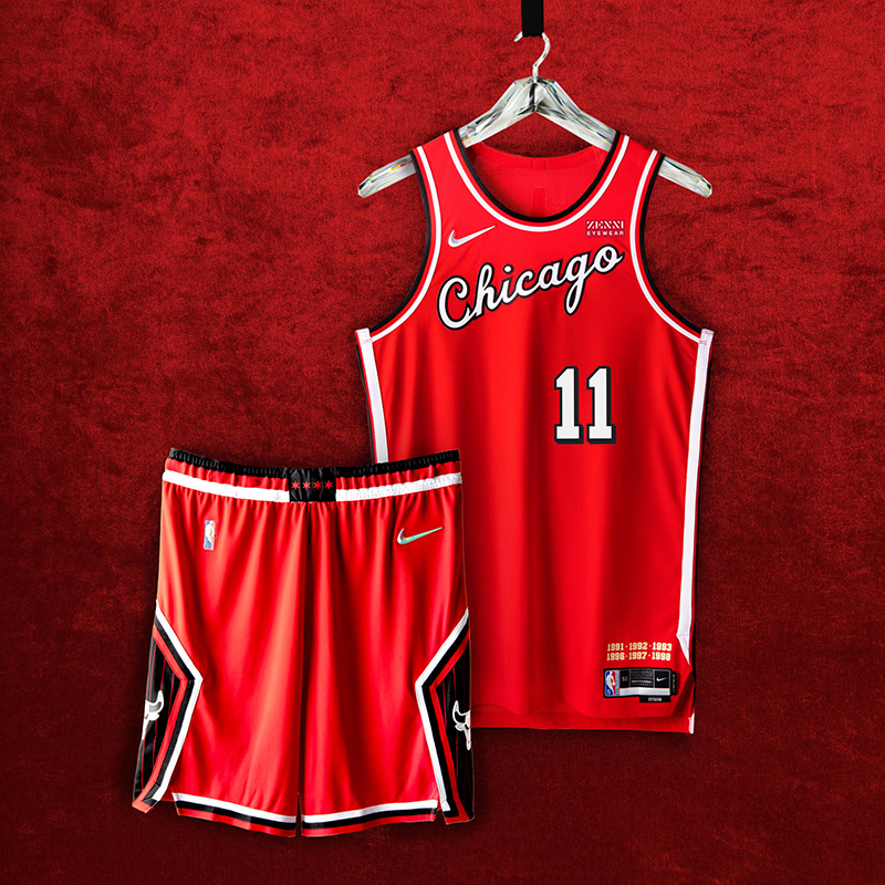
The unforgettable script from the Bulls’ debut ’66 season graces the jersey chest. Two callouts to the team’s three-peats cover the area above the jock tag. The four stars of the city’s flag stud the belt buckle, while on the diamond cutout of the shorts, a black pinstripe pattern hearkens back to the team’s second three-peat.
From Artis to Michael, we can’t wait to see Zach, DeMar, Lonzo and Vooch rock these City Edition jerseys this season. While these may look plain, the details on the shorts (just enough pinstripes), these Bulls jerseys come clean.
14. Sacramento Kings
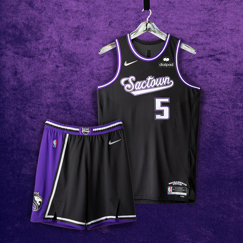
An asymmetrical stripe over the black base is an ode to the “Greatest Show on Court” teams of the early 2000s. The script wordmark is a staple of the team’s design, as it’s been part of the team’s history from Kansas City to its permanent home in Sacramento. The waistband features a remixed version of the Rochester Royals logo set in purple and black.
Similar to the Chicago jerseys, Sacramento’s clean kits are a nice bunch. Bringing back looks from the CWebb/JWill days will always rank high in my book. Good thing they kept the checkerboard look off this edition.
13. Los Angeles Lakers
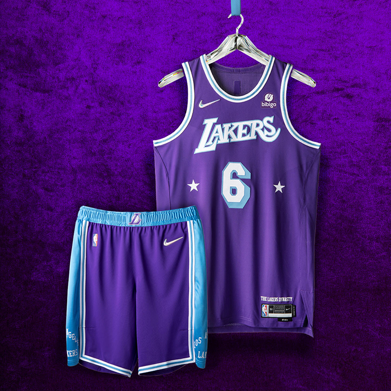
While the shorts incorporate the baby blue from the original championship team in Minneapolis, the primary head-to-toe color is the Lakers purple that emerged in the late ’60s. The belt buckle includes the “L” logo from the three-peat era of the 2000s.
I expect Laker fans to rank these higher and I won’t blame them. The design team did a good job in merging jerseys from the Minneapolis and Los Angeles eras of the franchise. The tilted Lakers wordmark definitely gives this jersey a nice touch to go with the stars crowding the number during the Elgin Baylor days of LA.
12. Charlotte Hornets
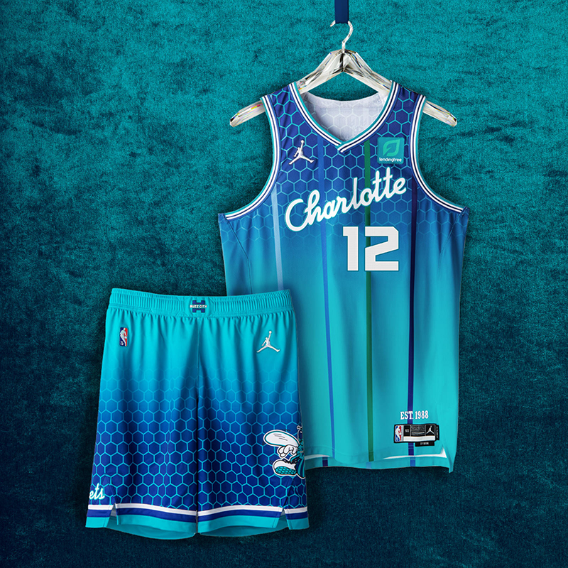
The “Charlotte” script wordmark has never been used on a Hornets uniform, a detail calling to mind the unveiling of the team’s original uniforms in 1988. On the front of the jersey, the numbers are styled in the way of the current Hornets font, right justified on the front as a throwback to the Bobcats jerseys from ‘04-’09 and ‘12-’14, and the player name on the back honors the classic Hornets font. The iconic pinstripes return in purple, green and blue, commemorating the first team in league history to wear them on a jersey. The shorts bring back the original Hugo design from the team’s founding year in 1988.
Am I the only one who ranked this outside of the top 10? The honeycomb is definitely a great addition to the teal jerseys. I don’t know, but they do give off that board shorts/swimming trunks vibe, right? Still liking them than a big chunk of the jerseys we’ve gone through.
11. Toronto Raptors
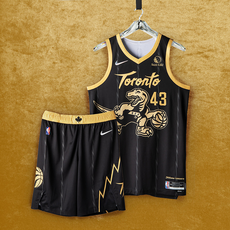
The popular black base and gold trim return, with the iconic dino logo, scrawled across the chest, donning the look from the 2019 title-winners and flipping the Raptor’s direction from the Nike NBA Hardwood Classic uniform. The jagged pinstriping and short design echo the team’s inaugural uniforms from a quarter-century ago. Today’s claw-scratch logo appears on the shorts, with a Canadian maple leaf on the waistband reminding fans of the team’s roots.
This has Drake/OVO written all over it. We’ve seen the Black/Gold jerseys over the last few years and they still look great. The jagged pinstripes from the ’90s are definitely a welcome addition to the ‘We The North’ vibe for the 6.
10. Utah Jazz
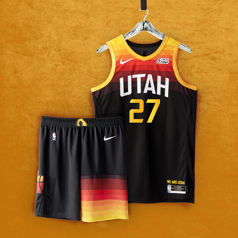
The Utah Jazz Nike NBA City Edition design from the 2021-21 season is the evolution of the gradient red-rock theme of the team’s original City uniform. The predominantly black uniform features simplified color bands strikingly positioned on the top half of the jersey and the left leg of the shorts. The asymmetry of the color bands on the shorts are an homage to the late ’90s uniform, which featured a mountain range on the left leg. The Jazz/state logo — representing how the Jazz belong to all of Utah — is featured on the right leg of the shorts. The Delicate Arch graphic appears on the waistband.
These would’ve been higher in my book but these are the exact jerseys from last season. I get that they can’t be bothered this season en route to their ‘mission’ of getting back to the postseason. The ‘Dark Mode’ version of the Red Rock jerseys are great and still look great when compared to the rest.
9. Phoenix Suns
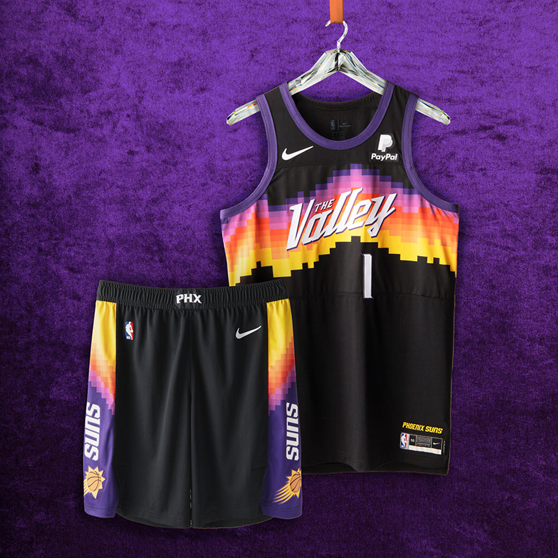
The Nike NBA City Edition design from the 2020-21 season is inspired by the Valley’s breathtaking scenery, using stark colors and pixelated, abstract lines to create the local geographic landscape. The horizontal striping across the chest uses a spectrum of color to create the hues for Arizona sunsets and sunrises. The classic Sunburst logo returns on the short, while the “PHX” acronym appears on the waistband.
So nice they had to run them twice. Just like the Jazz, Phoenix decided to run it back with their ‘Valley’ jerseys this season. After all, they did make it to the Finals with these jerseys. But by virtue of being a repeat jersey, #9 is as high as they can go this season.
8. Los Angeles Clippers
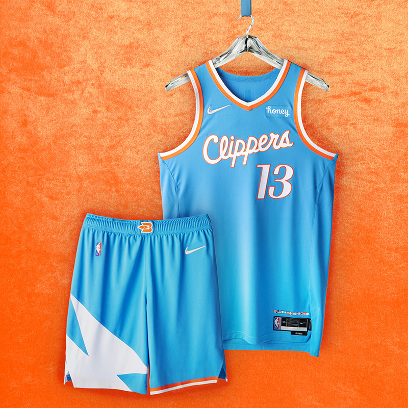
The uniform has a Pacific blue base color that was inspired by the team’s past incarnations as the Buffalo Braves and the San Diego Clippers. The jersey numbers and taping on the neck, arms and shorts are a tribute to the 1984 uniform design, marking the team’s first season in Los Angeles. The memorable Clippers script wordmark is from the 2015-16 season, linked to its high-flying roster. The uniform’s shorts feature the three white sails that were part of the original Clippers logo design, and part of the team’s first Nike NBA City Edition uniform in 2017-18.
Now this is how you separate yourselves from being the ‘other Los Angeles’ team. The Clips definitely did a good job paying homage to the franchise’s three stops. The colors do remind me of the Flint Tropics, in a good way. ELE!
7. Milwaukee Bucks
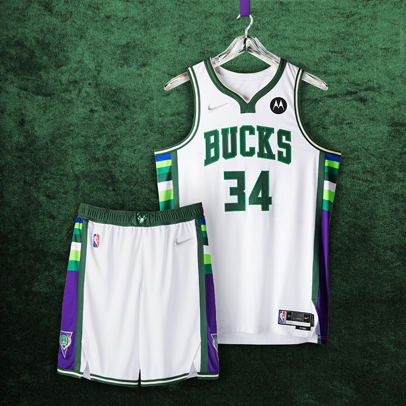
The uniform features green and Lake Michigan blue from the team’s current uniform sets, side panel blocking from 2001, the neckline from the 2010s, and the number set worn by the team during its second championship in 2021. A remixed waistband logo from 1971 is a callback to skyhooks and triple-double averages.
I’ve always liked the jerseys that came out of Milwaukee and these are up there as well. Kareem, Big O, Vinny, RayRay and Swizzy would be proud of this homage.
6. Washington Wizards
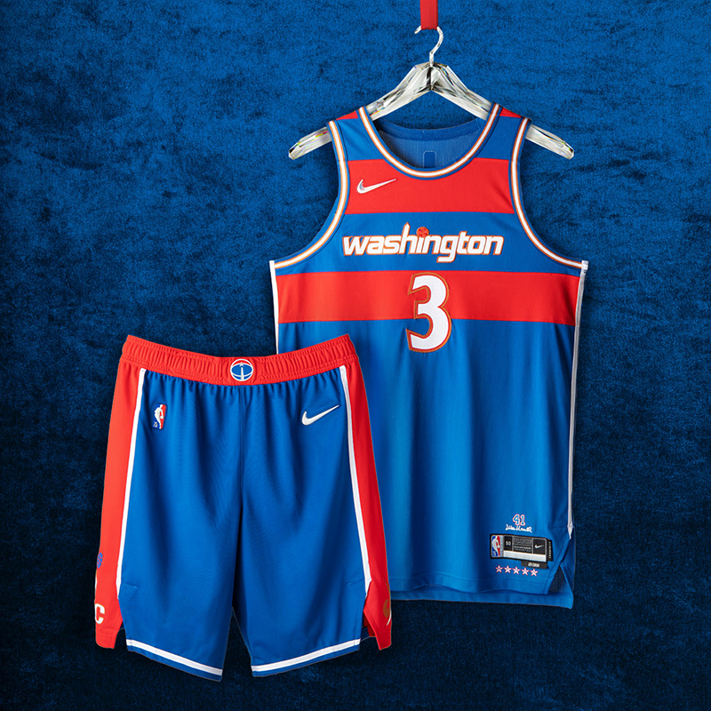
The red stripes on the blue base are a tribute to the classic Bullets uniforms from the ’60s and ’70s, especially from center Wes Unseld’s exceptional ’68 season, when he won both league MVP and Rookie of the Year honors. Below the red belt, the shorts feature a wide red panel on each side, a detail also brought back from the late ’60s. The “Washington” wordmark across the chest is a remixed take on the jerseys that highlighted the team’s inspiring playoff run during the 2016-17 season.
One of the bright spots for the Wizards over the last decade or so. From Wes Unseld to MJ to the more recent capital kits for John Wall and Bradley Beal, good one DC family.
5. Denver Nuggets
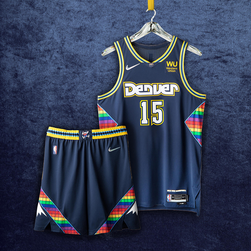
Uniform details from the team’s fast-breaking game play of the ’80s and its shocking postseason run in ’94 make their way into this year’s City Edition jersey. A shimmering rainbow tetris pattern returns on the side paneling, the shorts and the neckline. Maxie the Miner, the team’s original mascot, appears on the belt buckle. The number set stretches back to the ’93-’94 to ’02- ‘03 uniforms. The diamond insert is a tribute to the identity of the ’75–’76 ABA team.
The Denver skyline was always a great look for the Nuggets and applying that colorful palette to this one puts them in the top 5. The baby blue piping might be too much, but you gotta bring back something from those Melo years too, right?
4. Philadelphia 76ers
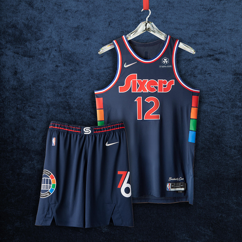
The team’s 40-year relationship to its home arena is celebrated by the arena’s logos on the shorts and the belt buckle. The arena’s signature multicolor pattern runs up the sides of the jersey. The deep blue body color is a deeper version of the team’s royal blue, while the wordmark, numbers and player names are inspired by the team’s graphic identity from the late ’70s.
While I do feel like these jerseys pay way too much homage to the Spectrum moreso than the actual franchise, I do like this deep blue shade for the Sixers. Pairing that blue with the retro wordmark, just fabolous. Adding the colorful patterns on the sides, I’m done. Would’ve been nice to see Ben rock these on court, though.
3. Minnesota Timberwolves
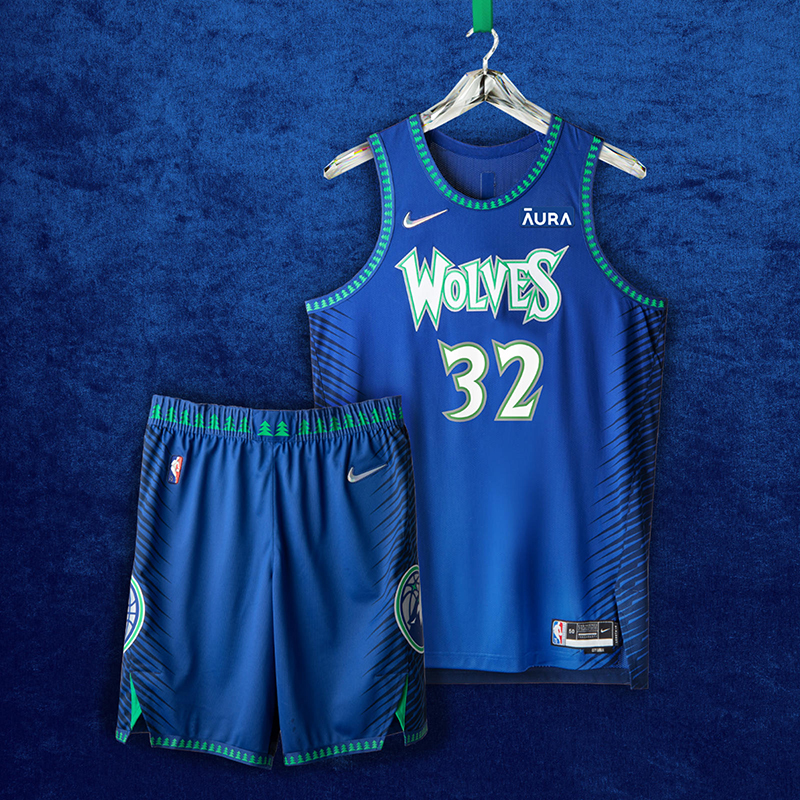
The blue, green and white color palette of the uniform returns from the team’s inaugural 1989 season. The wolf logo reflects the origins of the team, while the wordmark and forest images are inspired by the MVP-era early 2000s. Each side of the short is equipped with guard hair patterns to capture the essence of the wolf as well as resurface themes from the inaugural 2017-18 Nike NBA City Edition uniform.
If you can’t perform on court, might as well look good trying, right? The T’wolves are definitely turning a new leaf with KAT, Antman and DLo on board, and it would be nice to see them be inspired to play even better with these threads.
2. Portland Trailblazers
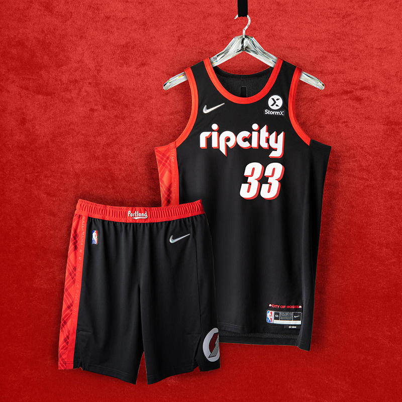
“Rip City” appears in the retro ’90s-style font with drop shadow. The belt buckle features “Portland” in the ’70s-style font from the original Blazers teams. A signature plaid pattern is a nod to a memorable feature of the city’s culture and also honors an all-time coach. A “City of Roses” anthem is a tribute to the city that supports its team.
When you incorpate plaid into your jersey and still look good, you’re automatically in the top 5. With tributes to Dr. Jack, the Clyde era and the Jailblazers of the early ’00s, Portland knocked this jersey out of the Moda center for all of us to enjoy.
- Brooklyn Nets
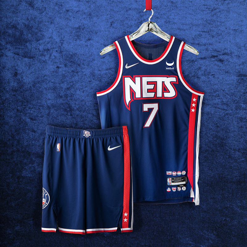
Marking the team’s path from New York to New Jersey and back again, the argyle side panel is a tribute to the repeat Eastern Conference championships from the ’01-‘02 and ’02-‘03 seasons. The patch on the shorts is a throwback to the ’80s, while the red, white and blue color blocking reaches back to the franchise’s ABA roots. On top of the navy body color, the black space symbolizes a team on the rise, poised to leave a new mark on the league.
It’s Brooklyn in the house! From the argyle pattern of the Kidd-era Nets to bringing key elements from the rest of their previous jerseys, Brooklyn did good with this one. It just makes it all the more better when you have KD, the Beard and Co. (sorry, Kyrie) rock them this season.
I’m sure you have your own rankings for this season’s City Edition jerseys and you can get them soon via the NBA Store. In fact, you can get Luka’s City Edition jersey now by clicking here.