Here’s a breakdown of this year’s NBA City Edition collection
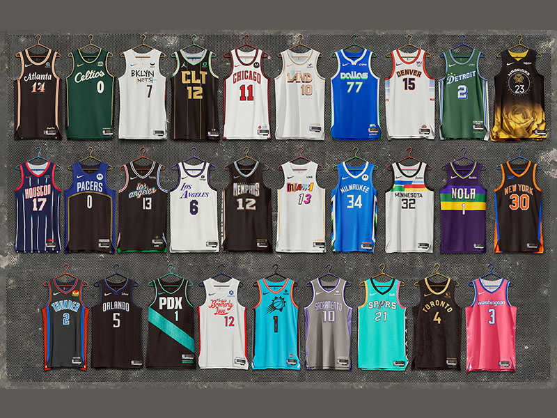
It’s that time of the year again. Nike just unveiled this year’s NBA City Edition collection, each representing stories, history and heritage of each NBA city. Go through each NBA jersey to see what they’re about.
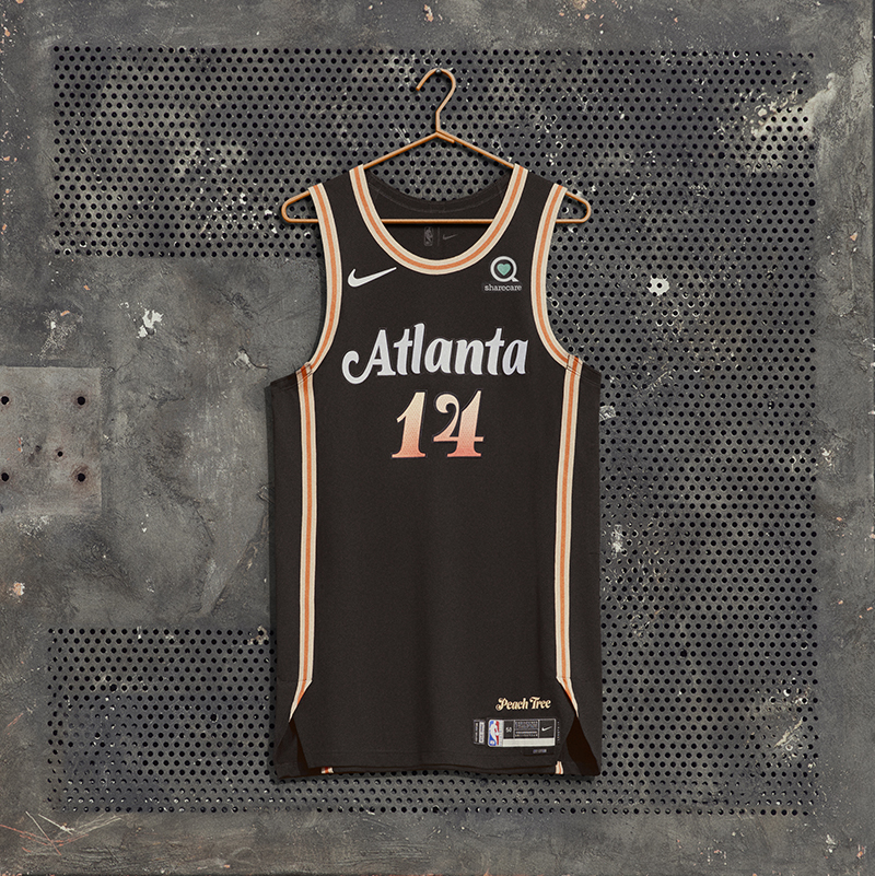
Atlanta Hawks
Atlanta’s uniform is a fresh take on the team’s original Peachtree uniform, which launched three years ago — the same amount of time it takes to grow a fruit-bearing peach tree from a seed.The jersey and short colors — a gradient from Electro Peach to Sunset Haze — and design represent the high energy and diversity of the city.The uniform pays the ultimate respect to Georgia, “the Peach State,” while uplifting the Hawks’ mantra of being “True to Atlanta.”
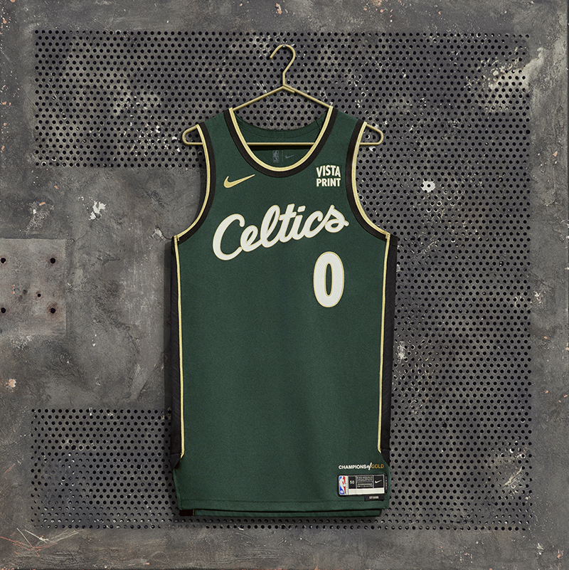
Boston Celtics
The uniform pays homage to Bill Russell, the 11-time champion and HOF center who defined the gold standard of what being a Celtic truly means. The stylized script wordmark is inspired by typography from the decades when Russell dominated the league. The anthem above the jocktag is emblazoned with the phrase “Champions of Gold.” The belt buckle features Russell’s retired number, 6, surrounded by 11 diamonds for each of his titles.
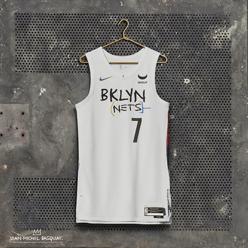
Brooklyn Nets
The uniform brings back a fan favorite with a new twist. Flipping from black to white this year, the Nets once again pay tribute to legendary Brooklyn-born artist Jean-Michel Basquiat.The front of the jersey reads “BKLYN NETS” with colorful side panels, while the shorts feature Basquiat’s distinctive crown motif with continuing side panels and the “BROOKLYN, NEW YORK” lettering. The uniform’s color treatment is inspired by the signature works of Basquiat’s designs.
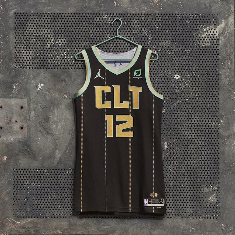
Charlotte Hornets
The uniform returns to the mint, gold and granite color scheme from the 2020–21 season. Most notably, “CLT” appears on the uniform for the first time, embracing the familiar airport abbreviation. The letters, along with the numbers on the front and back of the jersey, are gold with mint trim, while the player’s name on the back is gold with no outline. The uniform also displays pinstripes, which are designed to look like the ridges on a coin, alternating in gold and mint.
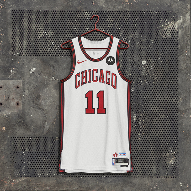
Chicago Bulls
The uniform is an ode to Chicago’s iconic architecture through the lens of the Chicago municipal “Y” symbol, which was introduced in 1917. The municipal “Y” is reflected in various elements of the uniform — the most striking example is on the sides, with two sets of five lines running downward and branching off at the shorts. On the uniform, the “Y” is front and center — it’s woven throughout the printed pattern, and it intersects with the “C” of Chicago on the belt buckle.
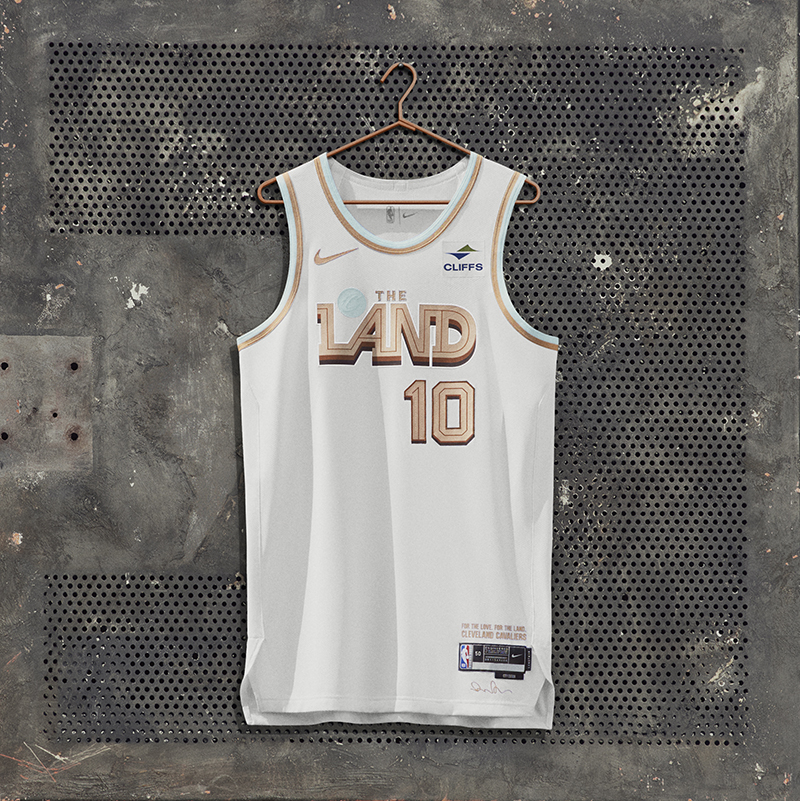
Cleveland Cavaliers
The uniform draws inspiration from the physical makeup of Northeast Ohio. It showcases the wordmark “The Land,” further connecting this uniform and team back to the city. The graphic is reminiscent of vintage Cavs logos from the ’80s, with a blue ball that represents the sunny shores of Lake Erie and tiered brown tones that take inspiration from the area’s soil. The phrase “For the Love. For the Land” is displayed on the anthem above the jocktag, symbolizing what basketball means to the region.
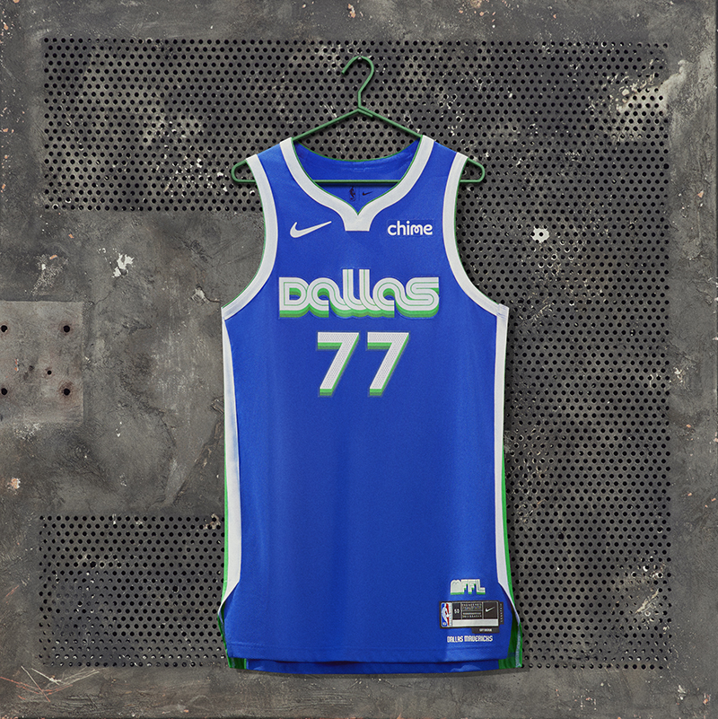
Dallas Mavericks
To celebrate the history of the Metroplex in their uniform, the Mavericks graphically rewind the clock to the retro fashion aesthetic of the late ’70s and early ’80s. By incorporating the team’s legendary color palette with an in-line groovy wordmark, the team achieves a modern take on a nostalgic design. On the anthem above the jocktag is the regional acronym “MFFL,” which stands for “Mavs Fan for Life.”
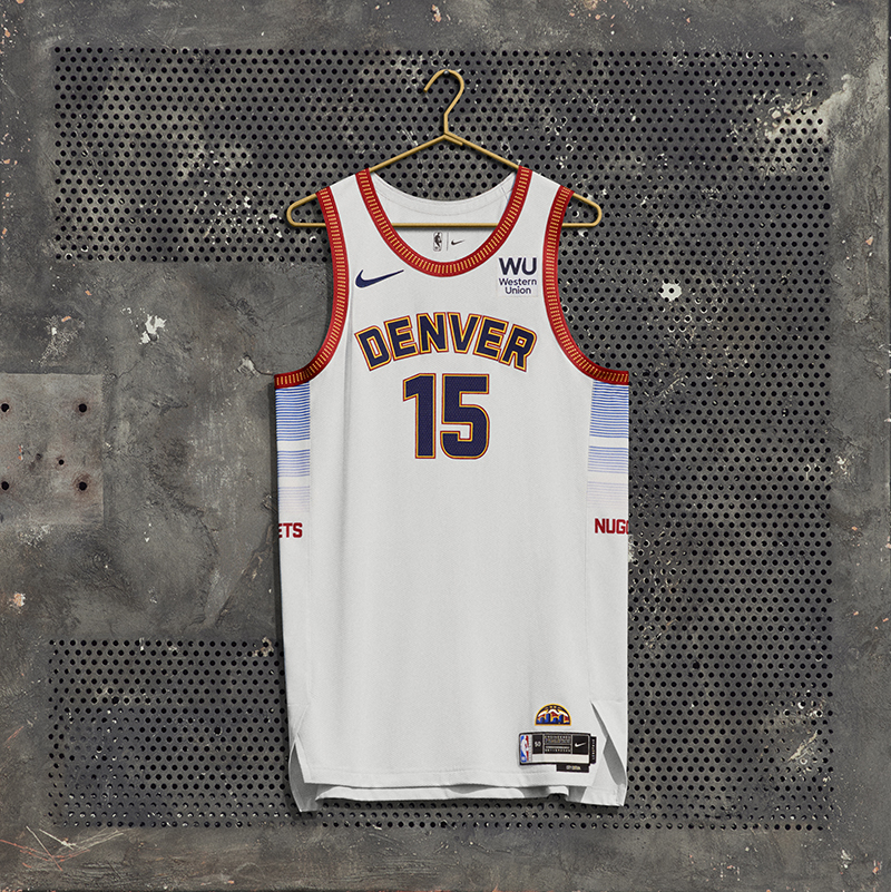
Denver Nuggets
The uniform’s design draws from the mile-high city’s iconic architecture, such as the bold “DENVER” lettering on the front of the jersey, a tribute to the revered neon sign at Union Station. The classic “Nuggets” wordmark is featured across the uniform’s side panels. A silhouette of the city’s skyline fades to a warm sunset with memorable colors from the franchise’s palette.
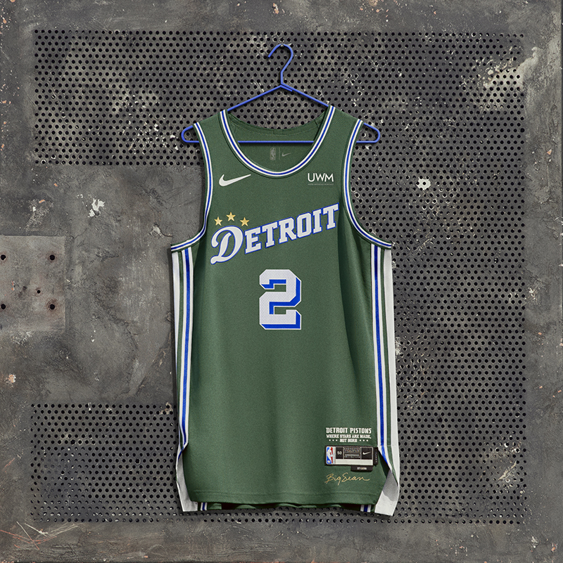
Detroit Pistons
Designed in collaboration with Pistons Creative Director of Innovation Big Sean, this uniform pays tribute to the gym at Saint Cecilia’s (aka “the Saint”), where many legends have played. The uniform’s green color represents the walls of the gym. A trio of stars on the jersey and shorts symbolizes the Pistons’ three NBA Championships. The quote inscribed on the court floor at “the Saint” — “Where stars are made, not born” — is featured on the anthem above the jocktag, along with Big Sean’s signature.
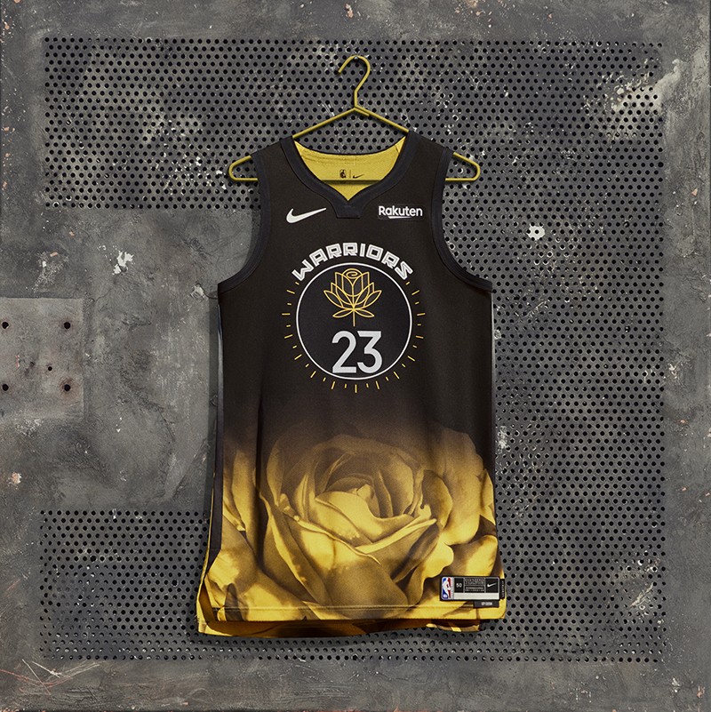
Golden State Warriors
Designed by Bay Area artist Allison “Hueman” Torneros, the uniform features a yellow rose as its graphic centerpiece, representing women who change the game and lead fearlessly. The chest emanates rays of sunshine, symbolizing the power of uplifting women, and the side gradient represents the diversity of the Bay Area. The graphic treatment of the rose is the first of its kind to appear on an NBA uniform.
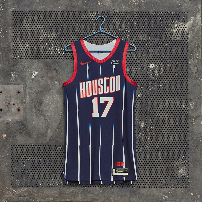
Houston Rockets
Bringing back last year’s design, this year’s uniform reminds Rockets fans of the rich history of the franchise. The font across the chest is pulled from the road jerseys worn during the team’s back-to-back championships, with the title years, ’94 and ’95, printed on the vents. The team’s “H-Town’ nickname appears on the anthem above the jocktag.
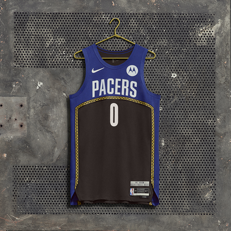
Indiana Pacers
Among the cathedrals of basketball throughout the state that grew basketball, the uniform celebrates the past and present of Gainbridge Fieldhouse with the theme “Built for Basketball.” The dark blue base is a departure from previous uniforms. The gold truss spanning the chest and running down the legs of the shorts mimics the arena’s distinct structure. The anthem above the jocktag hearkens back to the flipper board that was a staple for communicating game schedules at the older fieldhouse and beloved by fans.
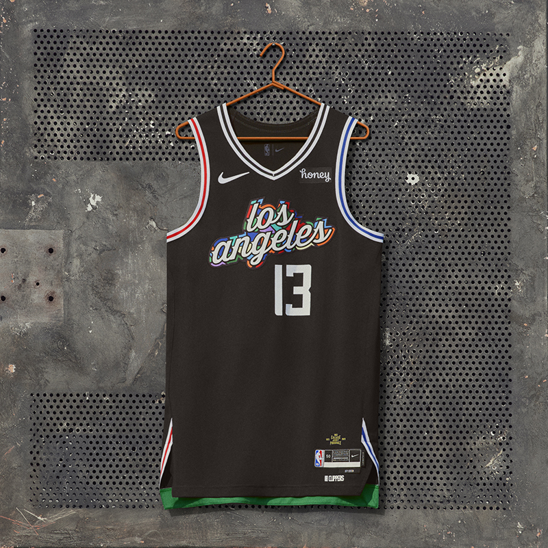
Los Angeles Clippers
The uniform celebrates the team’s deeply rooted bond with the South LA community, as well as the heritage and passionate spirit of the Drew League, the city’s most beloved community basketball league. The colorful mosaic design on the chest is inspired by the iconic Watts Towers, and the wordmark combines classic scripts from the Clippers and the Drew. The Drew League’s motto, “No Excuse. Just Produce,” is the City Edition Anthem above the jocktag, with dates celebrating the Drew League’s 50th anniversary adorning the sides of the motto.
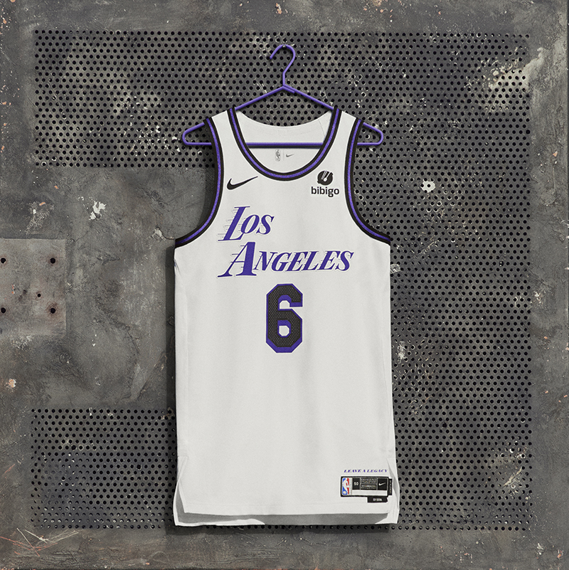
Los Angeles Lakers
Los Angeles is a city where artists know how to transform a blank page into a world of possibility. That’s the spirit behind this year’s uniform. The uniform has been intentionally stripped back to its most simple design. It becomes the canvas to help tell the stories behind individual changemakers around Los Angeles. Inspired by the conviction of the city’s changemakers, the anthem above the jocktag has a simple message: “Leave a legacy.”
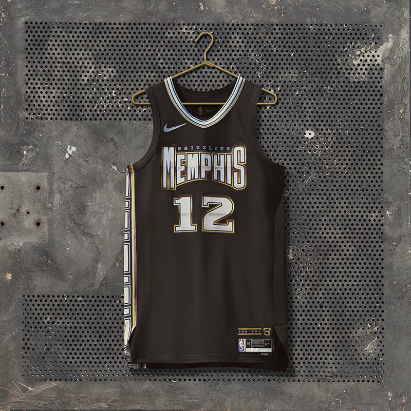
Memphis Grizzlies
The uniform serves as a tribute to the musical artists and albums that define Memphis hip-hop and its raw sound. Highlighted by chrome-inspired detailing and diamond textures, the design was inspired by local hip-hop album art and pulls in colors like the traditional Beale Street Blue framing “Grizzlies. Just above the jocktag, a Grizzlies grill and “For the M” represent the pride Memphians have for their music, their team and their city.
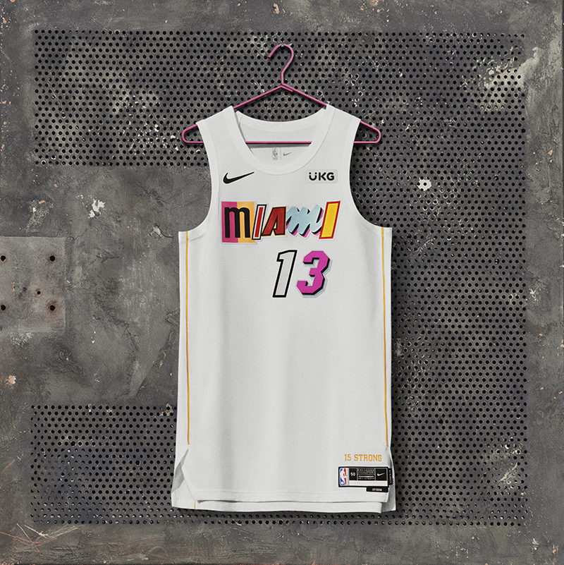
Miami Heat
The uniform is a follow-up to last season’s mash-up concept and swaps black for white as its base color while keeping all the other original design elements intact. The uniform once again features mashed-up renderings of the team’s “MIAMI,” “HEAT” and “ball and flame” wordmarks. Adding to the personalization, four new number fonts are now available. The uniform includes the “15 STRONG” anthem mark above the jocktag, yellow rope trim, a championship years’ belt buckle, and satin-striped side panels.
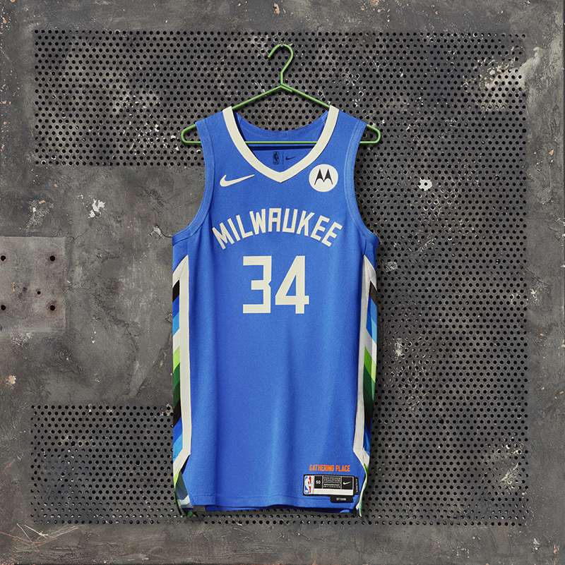
Milwaukee Bucks
The uniform embodies the spirit of Bronzeville, one of the most diverse and distinctive neighborhoods in Milwaukee. Historically, it was the city’s African American economic, social and artistic hub. Home to a tapestry of vibrant and unique murals, including the patchwork that’s adapted into the jersey’s side panels, the iconic neighborhood is honored with every stitch of this year’s uniform. The anthem above the jocktag lists one of the neighborhood’s nicknames: the Gathering Place.
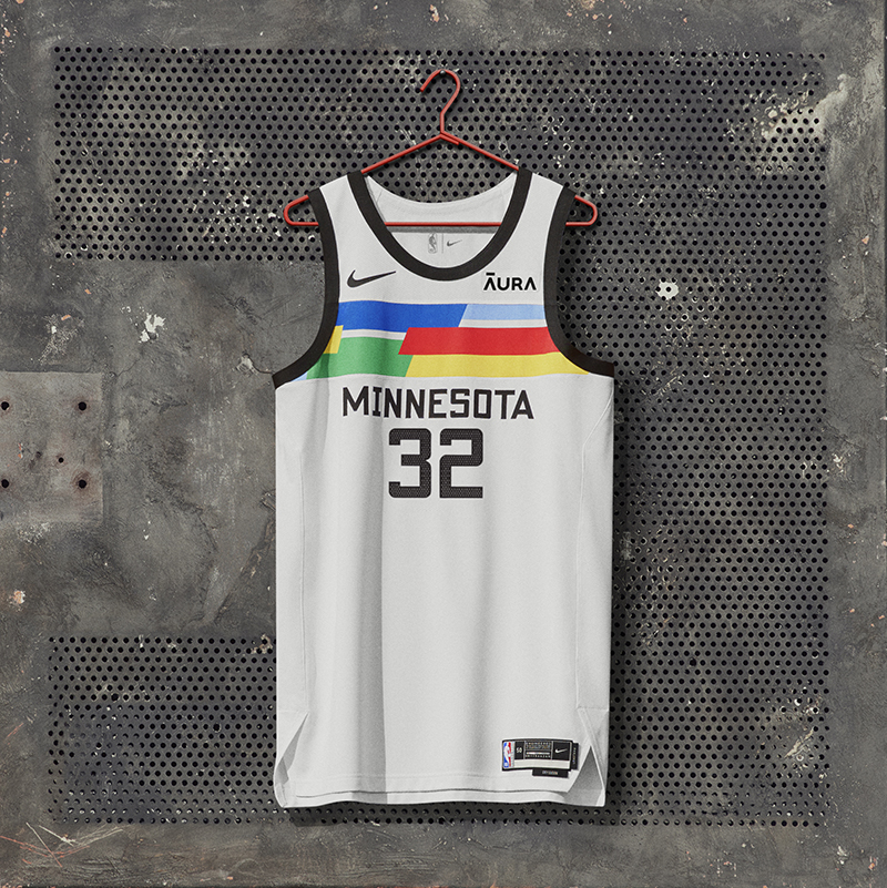
Minnesota Timberwolves
An artistic statement, the uniform is a colorful representation of the diverse, creative community that resides across the state. Every uniform is one-of-a-kind, featuring a unique chest pattern. The stylized Minnesota wordmark and jersey number were designed by a Minneapolis-based type designer and pays homage to an iconic building in the city’s skyline. The patterns emphasize the importance of leaving a distinctive creative mark, no matter the medium.
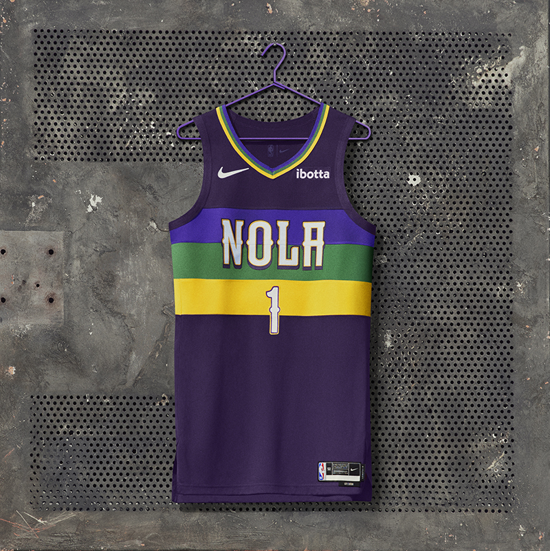
New Orleans Hornets
The uniform features the colors of the Mardi Gras season: purple, green and gold. Striping details feature these colors throughout the uniform, and three matching fleurs-de-lis appear on the shorts. The deep Purple Dynasty base color represents an evolution from past Mardi Gras uniforms and pays respect to the royalty that Mardi Gras krewes elect each season to preside over their events.
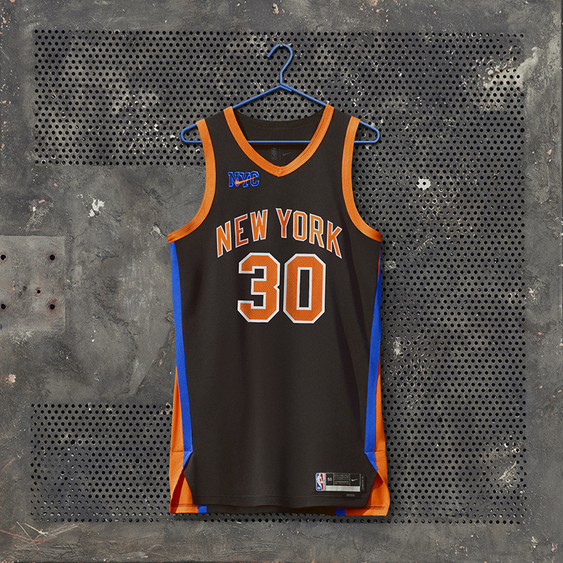
New York Knicks
The uniform is inspired by the memorable Knicks teams from the late ’90s and early 2000s. Designed in partnership with Kith, this uniform is a throwback to those teams. The jersey features a V-neck that’s inspired by the era while also showcasing inverted colors from the team’s seasons from 1998 to 2012. The color-blocking helps bridge the gap between past and present teams.
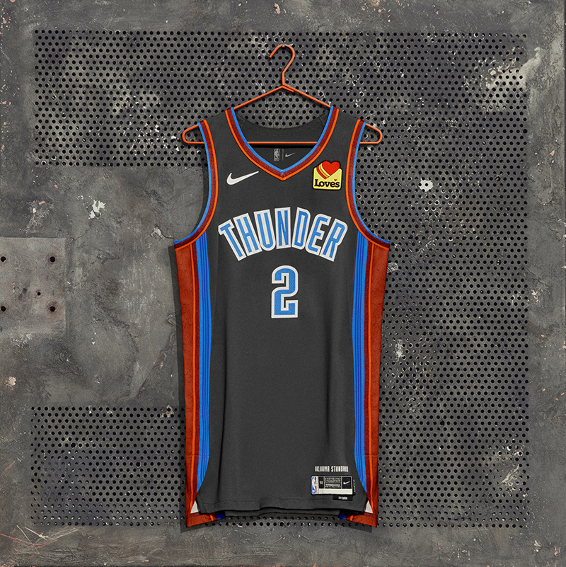
Oklahoma City Thunder
The uniform honors the people of Oklahoma through a depiction of “the Standard,” a set of values built on service, honor and kindness. That Standard is printed inside the uniform, under the chest. The “THUNDER” across the chest unifies the state, from the Red River to the plains to the Panhandle. Oklahoma’s geographic terrain is featured along the side panels.
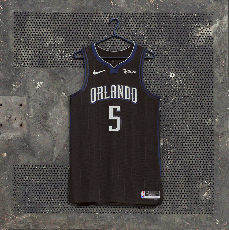
Orlando Magic
The all-black uniform reveals a metallic gray accent, evoking a suit of armor. A diamond pattern covering the jersey and shorts adds texture. The team’s signature logo is featured on the short, and the belt buckle is adorned with the team’s name in a modern Gothic font.
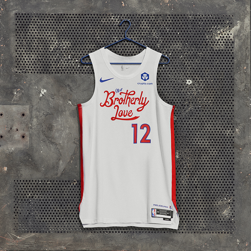
Philadelphia 76ers
The simple, clean design of the uniform honors the franchise’s rich basketball history. A retro “City of Brotherly Love” wordmark sits front and center across the chest. One of the team’s updated 76ers logos appears above the jocktag.
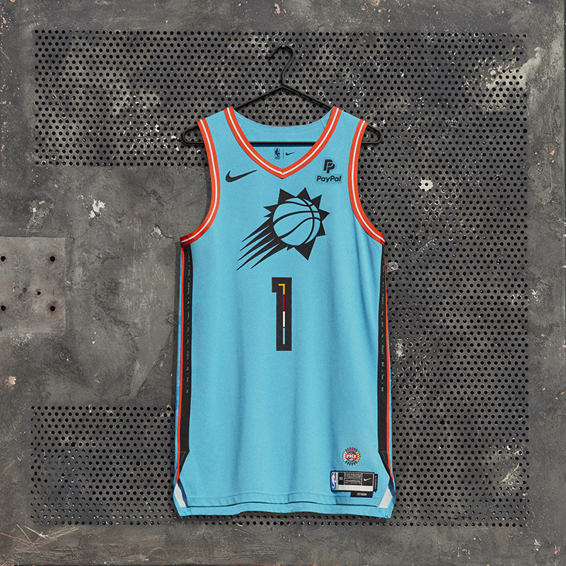
Phoenix Suns
The uniform features elements of each of the 22 tribal nations of Arizona, honoring the Indigenous communities that have shaped the land. The jersey nods to rez ball, a fast-paced style of play.The uniform’s turquoise base color represents the protection stone, which carries special meaning among the local Indigenous communities. The chest features the Suns’ primary sunburst logo. The PHX wordmark appears in a basketball surrounded by 22 red, yellow, white and black feathers and the colors of the traditional medicine wheel, depicting the four directions and cycles of life.
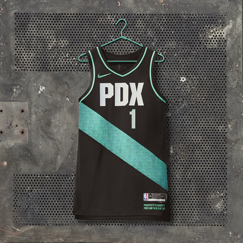
Portland Trailblazers
This uniform proudly pays homage to the signature PDX carpet pattern, which reached local icon status in the ’90s and falls into the “uniquely Portland” category. The distinctive, vibrant geometric pattern is displayed over a teal base, which streaks diagonally across the black uniform as the Blazers sash. The anthem is displayed beneath the jocktag and reads “#RipCityCarpet.“
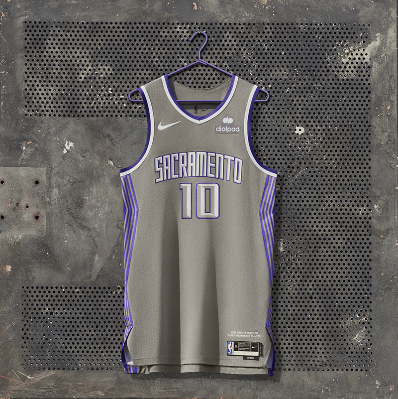
Sacramento Kings
As this season marks the 10-year anniversary of the fight to keep the Kings in Sacramento, the uniform is a tribute to a team and a city that are committed to staying together. “Sacramento” is on the front of the jersey for the first time since 2016. For the first time in franchise history, the Kings have a gray uniform, a color inspired by the Golden 1 Center. The anthem above the jocktag includes the signature of the late former NBA Commissioner David Stern, as well as his famous proclamation: “We are keeping the team in Sacramento.”
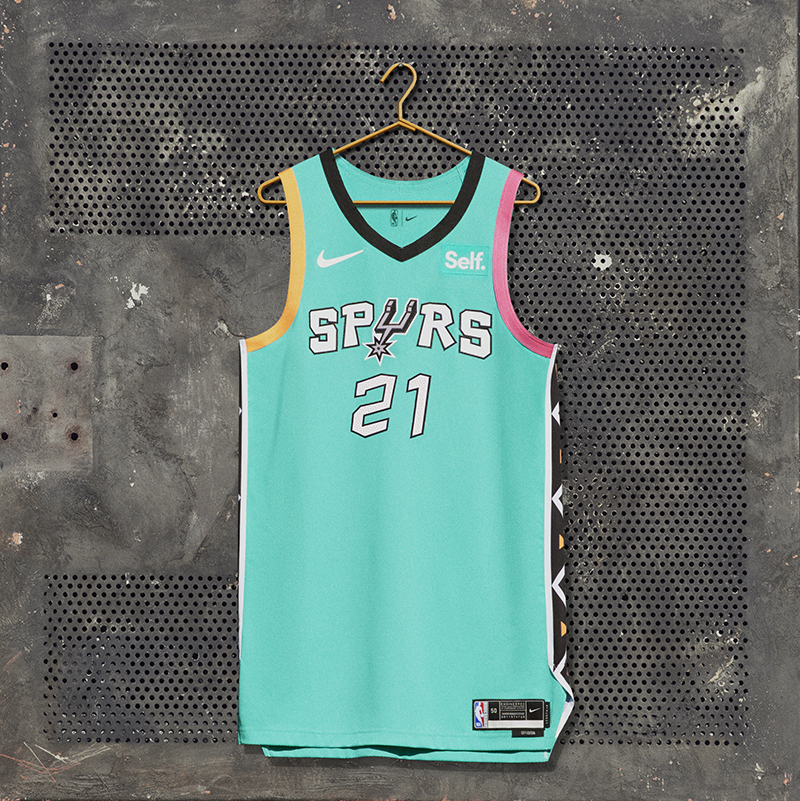
San Antonio Spurs
The uniform is inspired by the bold and colorful style featured during the 1996 NBA All-Star Game in San Antonio. The uniform has a rich primary turquoise color, along with retro accents of pink, orange and black on the taping and waistband. A festive geometric pattern runs down the side panels.
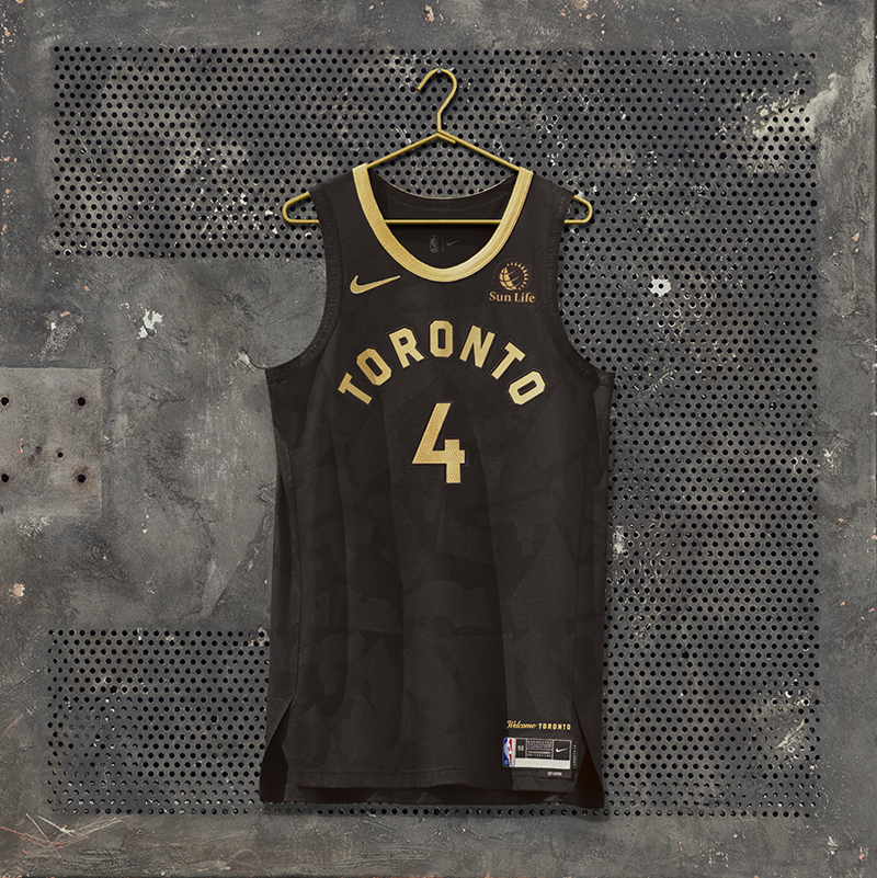
Toronto Raptors
With classic black and gold styling and subtle details, the uniform nods to the diversity and unity of Toronto. The city’s six boroughs are deconstructed to make an embossed pattern on the base. The phrase “We the North” is displayed in languages from around the world on the neck, arm and short trim, representing the diversity of the fans who love the game. The city’s six boroughs are deconstructed to make an embossed pattern on the base.
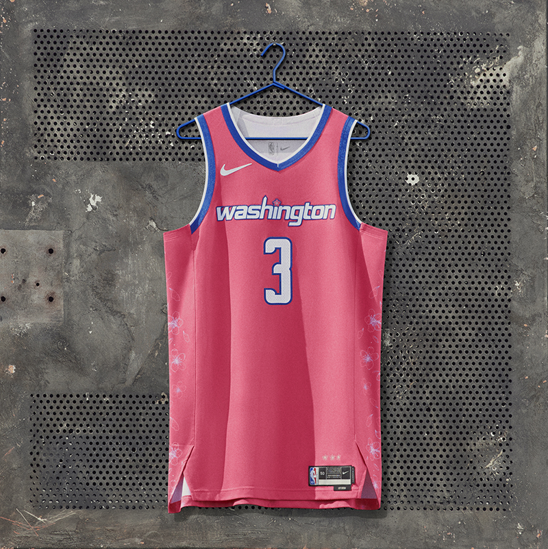
Washington Wizards
With a pink base and white accents throughout, the uniform pays tribute to the city’s iconic cherry blossoms. Falling petals down the sides of the jersey blend with a pink-to-blue gradient that symbolizes how the cherry blossom petals from the trees that line the Tidal Basin drift into the water below. Three distinct cherry blossoms sitting above the jocktag are meant to mirror the three-star design of the Washington, D.C. flag.
Select NBA City Edition jerseys are now available at the NBA Store.
*Utah Jazz didn’t release a new City Edition jersey, but released their purple Mountain Jersey from the 90s